The first image is visible by default. The component creates invisible vertical columns for the other images. Hovering over a column reveals the corresponding image.
Preview
Dart
// To stack the gallery and the numbered overlay, we use a parent Container
// styled as a grid where each direct child occupies the same cell.
Container(
  style: [Layout.grid],
  // The `*:[grid-area:1/1]` selector is applied via the `classes` property.
  classes: '*:[grid-area:1/1] rounded-box overflow-hidden',
  [
    // The HoverGallery component.
    HoverGallery(
      [
        img(src: '.../deepyr-hat-1.png'),
        img(src: '.../deepyr-hat-2.png'),
        img(src: '.../deepyr-hat-3.png'),
        img(src: '.../deepyr-hat-4.png'),
        img(src: '.../deepyr-hat-5.png'),
      ],
      style: [Size.maxW64],
    ),
    // The overlay with numbers. `pointer-events-none` is crucial
    // to allow hover events to pass through to the gallery underneath.
    div(
      classes: 'grid grid-cols-4 pointer-events-none font-mono *:to-black/10 *:via-transparent *:from-white/10 *:bg-linear-80 *:grid *:place-content-center text-white text-shadow-lg',
      [
        div([text('2')]),
        div([text('3')]),
        div([text('4')]),
        div([text('5')]),
      ],
    ),
  ],
)
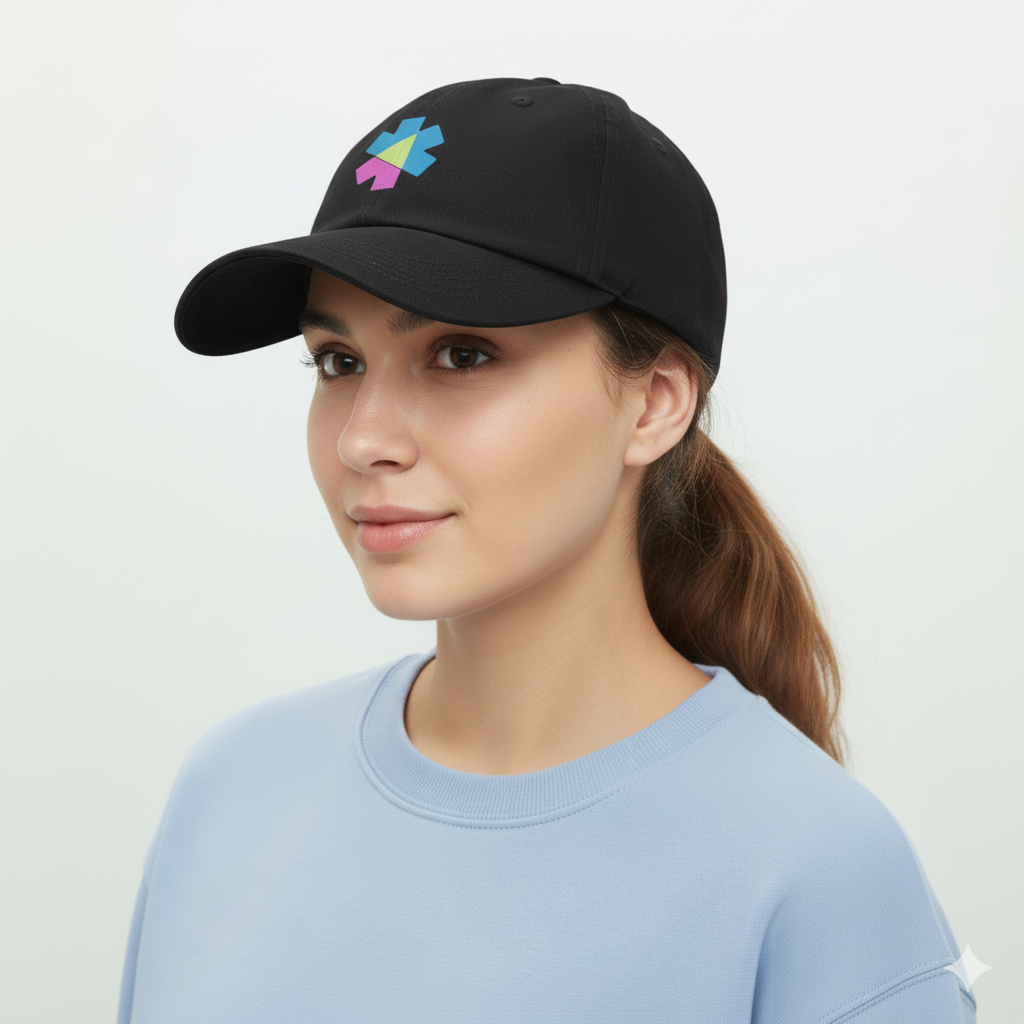
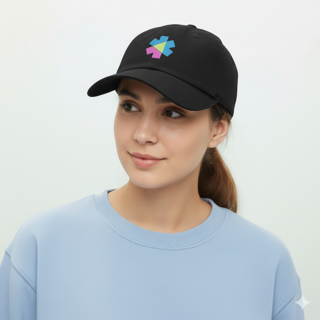
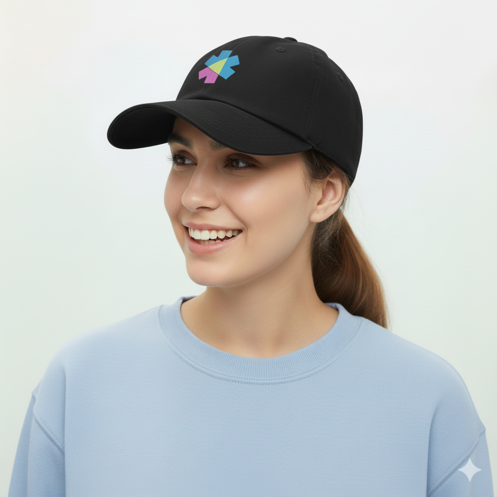
Move your mouse horizontally over the image to see other variations.
Preview
Dart
HoverGallery(
  [
    img(src: '/images/deepyr-hat-1.png'),
    img(src: '/images/deepyr-hat-2.png'),
    img(src: '/images/deepyr-hat-3.png'),
    img(src: '/images/deepyr-hat-4.png'),
    img(src: '/images/deepyr-hat-5.png'),
  ],
  style: [Size.maxW64,  Effects.roundedBox, Layout.overflowHidden],
)
The HoverGallery can be seamlessly composed within other components like Card.
Preview
Dart
final images = [
  img(src: '/images/deepyr-hat-1.png'),
  // ... more images
];

Card(
  [
    HoverGallery(images),
    CardBody([
      CardTitle(
        [
          text('Deepyr Hat'),
          span([text('\$25')], classes: 'font-normal'), // Direct string for price
        ],
        classes: 'flex justify-between',
      ),
      p([text('High Quality classic cap hat with stitch logo')]),
    ]),
  ],
  style: [
    Card.sm,
    BgUtil.base200,
    Size.maxW64,
    Effects.shadowSm,
  ],
)